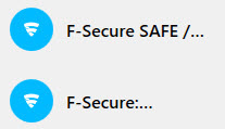
ID Protection: Too less characters of an longer entry are displayed in Vault
Vault: The title of longer entries is replaced with dots from a certain position.
These dots remain dots instead of displaying the replaced part of the entry while expanding the column. Only blank space is shown.
To see the complete entry you have to click on it.
This was done much better in KEY - please implement the same behaviour again, thanks.
Regards
PatchPanel
Comments
-
Hello,
Perhaps, it is even a bug report, rather then just feature request.
I mean, the very fact that it is possible to "expand" the column (it was unknown for me, actually) and then title still stays with "..."; In addition, when you hover it - no any tooltip about.
So, it is completely impossible to check title itself when it is long enough (only in "edit" form).
This was done much better in KEY - please implement the same behaviour again, thanks.
I did not remember already about F-Secure KEY implementation. Is it completely different and you want this style? Or, for example, when expanding the column - title will be fully visible (if possible), can be enough? Or a kind of tooltip when hovering "..." entries?
Sorry for my English.
Thanks!
-
Hello Ukko,
>>Perhaps, it is even a bug report, rather then just feature request.
yes, probably - do not know the intention of the programmers...
>>So, it is completely impossible to check title itself when it is long enough (only in "edit" form).
You have to select the entry which is cumbersome enough - switching to edit mode is not necessary.
>>Or, for example, when expanding the column - title will be fully visible (if possible), can be enough?
That would be fully enough (for me) i.e. dragging the column to a bigger size reveals more characters of the entry (like in KEY).
Tooltips... I don't know...I would prefer the a.m. behaviour.
>>Sorry for my English.
You're welcome 👍️
-
Thanks for your response and reply! And for your opinion!
You have to select the entry which is cumbersome enough - switching to edit mode is not necessary.
Yes, but I tried with Windows 10 laptop and with huge(?) title like "F-Secure SAFE / F-Secure TOTAL / F-Secure KEY / F-Secure ID GUARDIAN". So, I cannot see entire string unless I am in edit mode (or moved the column to the very left). Whether it is list of entries or card of entry.
This is also, probably, quite 'unintended" and a kind of indication of something wrong (limitation). Nevertheless, I am quite fine about the "..." and inability see entire title, since this at least shows that the title is not shown in full and you can still find a way to see it in full (and also good not to make the title too long). But the problem you described is much more "strange". I mean, when we move the column, the "entry title" in the list of entries does not change at all.
-


